Motorcycles are generally considered to be a dangerous form of transportation. Plenty of sources publish basic statistics to reinforce this idea, like the fact that even though the base rate of motorcycle accidents per registered motorcycle is about the same as that of cars 1, approximately 80% of motorcycle accidents result in injury or death (compared with ~20% of car accidents)2.
However, these sources rarely answer questions like:
- Which factors are the best predictors for motorcycle accidents or deaths?
- Does one type of unsafe operator behavior (like riding without a helmet) predict additional types of unsafe operator behavior?
These are the types of questions I was hoping to answer in this analysis.
The data set I used for this investigation was the California Highway Patrol Statewide Integration Traffic Reports System (SWITRS)3. This data set was readily available and large (constituting some 7 million collisions over 14 years), which avoided the usual "find the data" problem. On the other hand, this data was challenging to work with, because it included a complicated mishmash of possible features (with varying levels of data completeness, many of which were categorical), and it wasn't particularly tidy (records appeared to be entered as-is from traffic reports hand-coded by many idiosyncratic users, without much or any data validation). As such, most of my time on this project was spent cleaning data, validating data, and thinking critically about feature engineering.
The SWIRTS includes information about all collisions for all vehicles statewide, as well as all the parties involved in the collisions. So to look at motorcycles in particular, I joined the party dataset to the collisions dataset, and then filtered to include only the records where the vehicle in question was a motorcycle and the party in question was the driver. (As there's usually more than one party involved in a collision, this ensured there was only one record per collision, focused on the operator of the motorcycle). I mention this because it defines what we can and can't conclude based on this analysis. For example, my analysis can't describe anything about the safety of motorcycle passengers, and can't conclude anything about the behavior of the non-motorcycle drivers involved in a collision. All of this analysis is going to be conditional on "has been involved in an accident"; that is, we can't conclude anything about whether certain factors make it more or less likely to be in an accident. We can only conclude that, given that someone is already in an accident, certain features predict others. This is a fundamental limitation of this type of dataset, and it'll come up again later on.
Motorcycle Fatalities
As mentioned, I was interested in investigating both predictors of fatalities as well as predictors of unsafe behavior. My procedure for the two investigations was very similar, so I'll walk through it for the "fatalities" model and then simply present conclusions for the "unsafe behaviors" model.
Before doing any modeling, I dummy-coded the categorical variables, and then created a matrix of correlation coefficients to get an initial feel for the data. I like running correlation coefficients because it allows me (among other things) to keep an eye on features that are likely to be strong and useful predictors, to pinpoint features that don't seem very useful, and to identify and exclude useless inter-associations that might throw off my model (for example, "number injured in collision" and "number killed in collision" are very strongly associated, but that doesn't tell you much of substance - just that bad accidents are bad). Of course, correlation coefficients are only looking at linear relationships, so there's a lot they can miss, but they make a good first pass. Fatalities came out highly correlated with
- the age of the motorcycle driver
- riding under the influence of drugs, and
- the involvement of alcohol.
Unfortunately, while the SWIRTS includes fields for "violation category" (like unsafe speed, reckless driving, improper passing), it became clear at this stage that these were unlikely to be useful features due to inconsistent data entry.
For my initial models, I ran straightforward random forest classifiers from scikitlearn. I've had good results in the past with this module for this size and type of data, and since I was primarily focused on identifying important factors (rather than very fine-tuned quantitative predictions) I wanted something where I could easily see feature importances, without complexity overkill. I split the data into train, test, and holdout sets, since there was plenty to go around. This model achieved 97% accuracy on the holdout set. Top feature importances were as follows:
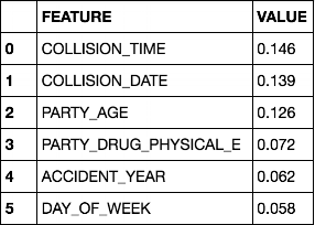
(where 'PARTY_DRUG_PHYSICAL_E' = under influence of drugs)
When I saw this, I was a bit suspicious - collision time, collision date, and party age all happen to be the features in the dataset with the highest number of bins. Scikitlearn's random forest classifier feature importance calculation is based on the Gini importance, which is biased towards high-cardinality variables.4 To resolve this, I first asked myself whether I actually needed such finely-scaled data in those variables. I decided that I definitely didn't for collision time, and replaced it with a 24-bin "collision hour" feature. Most of the information in "collision date" was also in "accident year", which was already in the analysis, so I threw out "collision date" entirely. I then reran the model, and the top feature importances order changed to:

I still wasn't fully satisfied (party age and hour still were the features with the most bins), so I implemented a second workaround to feature importances being potentially biased in this way - which is to drop the feature entirely, retrain the model, and observe the drop in accuracy or other performance measures compared with the original model resulting from the missing feature. While the feature-dropped models resulted in only negligible drops in accuracy, the precision and recall scores tell a different story:

Both age-dropped and hour-dropped models resulted in a definite drop in precision, so they're both still important. (You might notice that the hour-dropped model performed even worse comparatively than the age-dropped one, despite being ranked as a less-important feature: age has about three times as many bins, so evidence for exactly the feature importance bias I was concerned about.)
Speaking of precision and recall!
While the overall accuracy looks excellent, that recall is pretty poor for the "fatalities" class. In a case like this one, where we have many records but only a few of them result in fatalities, this points to a class imbalance problem. The model is leveraging the fact that fatalities only pop up 3.5% of the time, so in theory if it only ever predicted "no fatality", it'd be right 96.5% of the time. (It's not quite that bad in practice - this model is predicting fatalities about 1.5% of the time.) There are a few ways to deal with this, but a simple method is to undersample the majority class in the training set (another is "use a random forest", but we already did that). Undersampling can cause reduced model power (due to discarding some of our data), but this data set is large, and again: we're looking at factor importance here, not necessarily "most powerfully quantitative predictive model." So I went with an undersampled 50-50 class split as a good place to start, and the precision and recall scores changed as follows:

This is much more evenhanded, and I was satisfied for the time being. The most important features predicting fatalities were party age, the hour of the day, the day of the week, drug intoxication, and alcohol intoxication.
The hour of day relationship is particularly striking:

We can see fatalities are much more likely to occur at night. There's a couple dips that suspiciously correlate with rush hour - perhaps there's more vehicles on the road, but the average driver is safer? Also, we can definitely see why this didn't pop up in the correlation coefficients matrix: this definitely isn't a linear relationship.
The age vs. fatality-likelihood relationship might not be what you were expecting:

General wisdom says something like "young people are more reckless and have less experience operating a vehicle", so maybe we'd expect them to be more likely to die in an accident. My interpretation of this is we're looking at the importance of that conditional "given an accident has already occurred" that I mentioned earlier. It may be that young people get in more accidents, or it may not - we can't tell that one way or another from this data set. But this relationship shows a slow and steady increase in the likelihood of dying, conditional on already having gotten in an accident, as age increases (the error bars on the top end tell us that the bit where it gets all weird isn't too reliable, because there isn't enough data in those age bins).
Fatalities are notably more likely on the weekends. This checks out with other sources' analysis on the same topic:5

1 = Monday. 6 and 7 are Saturday and Sunday.
The relationship between alcohol and fatalities was an interesting one.

Although alcohol didn't show up particularly high in the feature rankings - a far distant fifth - it's quite clear from these averages that when alcohol is involved, fatalities are more likely. My best guess is this is because of its relative scarcity in the dataset: it's only present in about 8.5% of the samples. Perhaps it's important when it appears, but it appears so infrequently that the signal gets drowned out by other predictors. This is a good cautionary example about using data models - created to answer a specific question - like "what combination of features best predicts an outcome such as fatalities" - to answer different, more everyday behavioral questions - like "is it a good idea to drink and drive". (I have a whole post about something related, here.)
Unsafe Behaviors
This model went through essentially all the same steps as my fatalities model, described above, so I'll just share the conclusions. The goal of this model was to see if unsafe behaviors in the collisions dataset would predict other unsafe behaviors - I used "not wearing a helmet" as the target variable. In essence, do operators engaging in unsafe behavior tend to engage in other unsafe behaviors at the same time? This model's predictive power suffered a bit from less data - unlike fatalities, the "unsafe behaviors" features were relatively inconsistently coded, and had a much bigger class imbalance problem. The class-balanced model was hitting about 66% accuracy, recall 72% and 60% for "helmet" and "no helmet" classes, respectively. Some room for future improvement here, for sure.
The top feature importances predicting not wearing a helmet were age (by a significant margin!), hour of the day, day of the week, and alcohol involvement. Here's a visualization of age versus the likelihood of a fatality in the dataset:

Teenagers extremely less likely to wear a helmet. Do note that the legal driving age for motorcycles in California is 16.
The hour-of-day relationship is very similar to the fatalities relationship, except with a much more pronounced dip for morning rush hour and less pronounced for evening:

People who drive late at night don't seem to wear helmets as often.
The day of the week relationship is also similar to fatalities, although less pronounced overall:

Riders are less likely to wear helmets on weekends.
Not wearing a helmet is associated with higher likelihood of alcohol involvement in the crash:

...despite alcohol involvement not being a particularly highly-ranked feature in my models. The reasons for this are likely similar to those for the fatalities models, discussed above.
Even citations for unsafe speed were associated with not wearing a helmet, despite not being even remotely highly ranked as a feature:

There was very little data for this feature, so this is a more low-confidence result. A pattern does seem to be emerging, though, that the "unsafe operator behaviors" are inter-related.
This post presents only a fraction of my work with this data set (otherwise it'd take days to read) and there's lots more yet to be done! I plan to publish a Part 2 at some point soon. The first expansion of this analysis will be to look more in-depth at only the records for which the motorcycle drivers were at fault (I had skimmed the correlation coefficients and didn't see anything that stuck out as terribly different, so I deprioritized it in my workflow). Running a PCA or similar dimension reduction for the "do unsafe behaviors cluster together" question might be interesting. After that, more model tuning, especially with different methods of class balancing: I definitely want to see what the imbalanced-learn library can do here.
1. National Highway Traffic Safety Administration
2. Insurance Institute for Highway Safety
3. Available at http://iswitrs.chp.ca.gov/Reports/jsp/CollisionReports.jsp. Yes, it is "Statewide" instead of "State-Wide" like the acronym. No, I don't know why.
4. see e.g. http://explained.ai/rf-importance/index.html#2
5. e.g. Insurance Institute for Highway Safety, again