A neat set of graphs was circulating on social media, called "The Effect of Life Events on Life Satisfaction".

I was curious about the methodology, so I dug into the source, and discovered that there are two open-source versions of this paper. Uniquely, the 2006 version is an earlier version, and provides a cool opportunity to look at these graphs in both raw data and post-analysis form.
It's a great case study for analyzing confounding/lurking variables carefully, and thinking critically about the real-life interpretations of those variables.
Here's briefly how the analysis worked. The authors used a large longitudinal dataset that included a self-reported "life satisfaction" score for participants, as well as data on various life events the participants were experiencing. They looked at life satisfaction after the event/event onset ("lags") and leading up to the event ("leads"). The 2006 paper shows graphs for the raw happiness scores of their first analysis, in which they controlled only for "fixed" effects (essentially, accounting for the fact that happy people may self-select into happier life events, and vice versa). The 2007/8 paper shows the graphs from the stand-alone graphic, from their second analysis - a multivariate regression, which aimed to isolate the effects of a wide variety of potentially confounding variables (e.g. personal health problems, age, other major life events). That unlabelled Y-axis is the coefficient on the regression variable.
Here's where comparing these graphs tells some interesting stories about lurking variables.
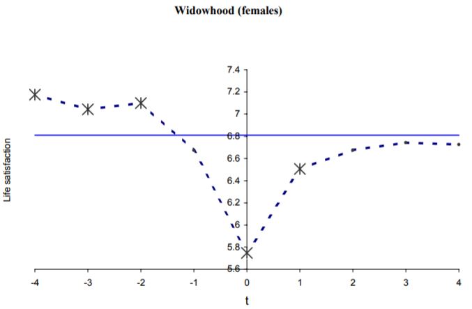
If you look at the raw 2006 data, widow(er)s look happier before their spouse's death (predictably), and that happiness recovers somewhat several years out, but not completely:
However, when they run the regression analysis and control for education, nationality, # of children, age, household income, individual health concerns, marriage state, and employment, that effect goes away, and if anything, the participants end up looking happier afterwards:

Since all the variables were controlled for at once and we don't have access to the raw data, we can't tell exactly what happened here - but clearly, one or more of those lurking variables are responsible for lower self-reported happiness after the death of a partner than could be predicted by death of a partner alone. Some non-inclusive possibilities:
- Children, being an additional burden to care for alone
- Loss of a second source of income leading to cash flow problems
- New health concerns
So this raises the question, when we remove these variables from the picture, how much does the remaining analysis reflect any situation in reality? When we ask a research question like "how much does widowhood affect happiness," if that widowhood often leads to secondary happiness-affecting issues like sudden single parenthood, loss of household income, etc., is it truly appropriate to remove those variables from the picture?
For a clearer example, let's look at layoffs:
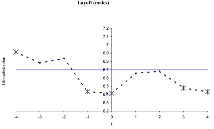
These two graphs look very different, and when we look at the fine print, we discover that one of the things the second one is controlling for is income! So it's a realistic portrayal of... all those layoffs that don't result in a drop in income. (Ever had one of those? Me neither.)
Now, to be fair, the authors did this on purpose: they were curious about the psychological effects of e.g. layoffs independent of the income effect. These graphs don't describe aggregated people in real-world situations, they describe vacuum effects. However, when these graphs escape from their original context into social media and the world at large, suddenly people are looking at them to answer a different question: "If I get laid off tomorrow, how will I feel in three years?" Now they're being interpreted as aggregated people. But they're people that don't (or rarely) exist: all those people that get laid off without losing income, or whose spouses die with no secondary effects whatsoever. It's a cautionary tale about statistics out of context.